USAGov and USAGov en Español offer a wide range of government information and services organized by topics to make it easy for people to find what they’re looking for. But navigating through different sections within our sites could be challenging and overwhelming for our visitors, especially first-time users.
During user testing, we’ve seen that people sometimes miss key navigational links when trying to find information on a long page. As they scroll down the page, it becomes challenging to easily and quickly find related topics or key links located at the very top of the page. It’s also a common problem for our mobile users. So we decided to explore new ways to improve the user experience when navigating through all the different topics and services on our sites.
We know the importance of having quick access to navigation areas and how helpful it is for our visitors. Whether they explore the main topics or use the search engine, making those key areas visible at all times would reduce the amount of time and frustration for users completing a specific search.
A few months ago, the USAGov User Experience team began studying the concept of sticky navigation for our websites. The team conducted research and usability tests before implementing these new navigational elements on our sites.
What is Sticky Navigation?
Sticky or fixed navigation is a website menu that is locked into place so it doesn’t disappear when the user scrolls down the page. In other words, it’s accessible from anywhere on the website without having to scroll.
Steps We Took in Exploring This Concept
- Reviewed outside research - We read research on the effectiveness of sticky navigation. Some of the overall conclusions were:
- Sticky menus are quicker to navigate and can cut up to 36 seconds off a five-minute visit to a website.
- Participants preferred sticky menus without knowing why. They said that a website with sticky navigation was easier or faster to use.
- Sticky navigation is ideal for long pages. It helps visitors make a smooth journey through content.
- It works best with specific demographics. Sticky navigation helps older adults and younger users who aren’t as confident on the web.
- Analyzed data from our websites - Data from people who visited more than two pages showed three common navigation behaviors:
- Clicking on the “What’s On This Page” box, which has anchor links to other sections of the page.
- Clicking a link in the left navigation or the same section within the header.
- Clicking a link to something else within the site, such as a header.
- Created prototypes - We used a tool called InVision that let us quickly put together a low fidelity working prototype without having to implement any code. We built five versions of the prototype in desktop and mobile using mockups and integrated them into the tool that provided URLs for further user testing. You can see an example of one of the InVision prototypes we created.
- Conducted in-house research and user testing - Once we had the InVision prototypes working, we used them to answer three main questions from our own research:
- How effectively will sticky left and top navigation elements help our visitors navigate our websites?
- Does sticky left navigation make it easier or more difficult to navigate within a topic?
- Does sticky top navigation make it easier or more difficult to navigate from one top-level topic to another?
We then conducted eight separate, unmoderated usability tests with nine participants. Each used the prototypes and the static version of the navigation for comparison. We tested versions in desktop and mobile resolutions.
Usability Test on Sticky Left Navigation: Desktop Findings
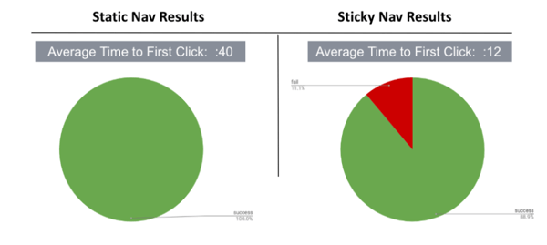
- Task success rates for both the static and sticky left navigations were excellent. The one participant who failed the sticky navigation test had a problem with the labels of some links in the left navigation, not the navigation itself.
- Average time to first click was significantly faster with the sticky navigation (40 vs. 12 seconds).

Usability Test on Sticky Top Navigation - Mobile Findings
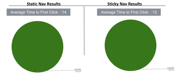
- Task success rates for both the static and sticky top navigation were excellent: 100% success for both designs.
- The time to first click was slightly better on the sticky navigation design (14 seconds vs. 12 seconds on the English site and 11 seconds on the Spanish site).

5. Implementation - We analyzed the English and Spanish usability testing results and feedback and then discussed findings and recommendations with the product owner and with the development team. They created and implemented the code on the websites.
We launched our sticky navigation elements a couple months ago and are keeping an eye on the data to see if we need to make any refinements. We’ve already seen users interact with them while performing other types of usability tests on our websites.


_v003.png)