Two weeks ago, we discussed how we chose our new name: USAGov. Today, in the third installment of our ongoing series about our rebranding efforts, we’ll talk about our new logo.
Building a logo can be like choosing a baby’s name.
Except that there’s at least one key difference: Most parents don’t have the luxury of knowing their baby’s personality before deciding on a first name.
Conversely, most companies know what kind of personality and ethos they want to convey when deciding on the colors, the graphics, and the language that will comprise their logo.
At USAGov, we pride ourselves on being trusted and helpful as we work to connect the general public with government information and services. We’re here to help, whether it’s getting a new passport, or finding the correct tax form, or learning about Social Security benefits.
In that same vein, we wanted to convey a personality that was approachable and friendly. And as a federal program, we also wanted to make sure we were coming across as official and trustworthy.
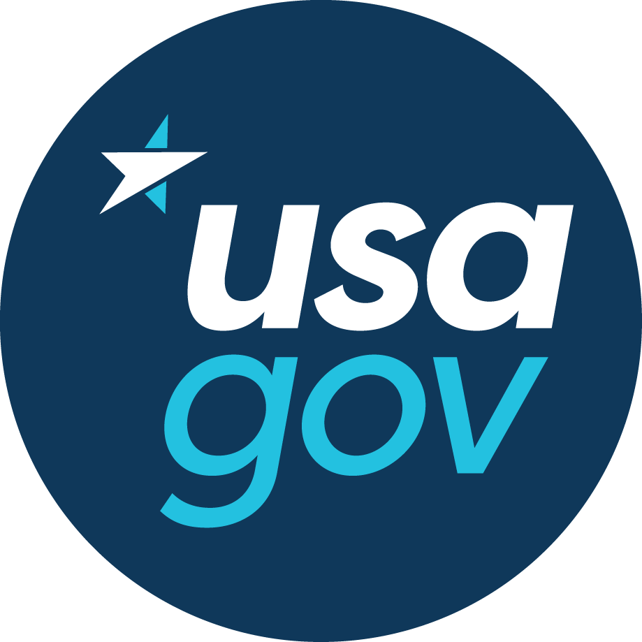
So, after designing, redesigning, narrowing down our choices, and then tweaking, we came up with the logo above.
Let’s begin with the star. To us, it represents the fact that we are a resource from the United States government. But you’ll notice too, that the white part of the star is also a compass needle, representing our role as the “guide” to government information and services.
We chose a clean typography and basic geometric shapes — the circle, the star made of triangles — to try to capture that friendly, approachable feel. And we liked the combination of dark and light blues: the darker blues convey a trusted government feel, and the lighter ones make things a touch more casual, friendly, and modern. (Blue is also the world’s favorite color.)
While we are a federal program, we ultimately chose to stay away from adding traditional red to the white and blues. We felt the color might come across as a bit too bold. The blues, we felt, were more stable. And this color pattern, we hope, will help differentiate us.
There is, of course, another consideration when building a logo: Your audience. And in many ways, a logo can be a self-fulfilling prophecy in terms of the people you’re targeting. You probably wouldn’t go into an interview wearing shorts and sandals; nor would you wear a suit and tie to a neighborhood block party. You want your look to speak to the groups you’re trying to reach.
Our audience is extremely broad — from students, to seniors planning for retirement, to people interested in immigrating to the United States, to government partners and agencies. The circle is meant to be inclusive, and unifying, and we hope there is at least one element to this new logo that will speak to everyone.
Coming soon: What’s next for USAGov?
Sarah Crane is the Director of USAGov.
_v003.png)