The process of searching for and bidding on federal government contracts is complicated, and last year our research revealed that it was an area the public needed help navigating.
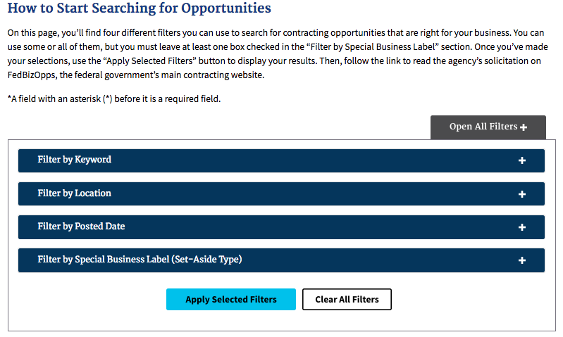
The research specifically showed that first-time contractors had a very hard time finding open federal contract opportunities they were eligible for. So we decided to create a tool that could help them through the search process. Our goal was to build a tool that provided some of the information found on FedBizOpps.gov, but was specifically built for beginners.
In the end, our team of 10 people - including designers, developers, accessibility specialists, a content specialist, and a data scientist - developed a beta version of a tool we named the Contracting Opportunity Finder.
Here are seven key lessons our project team learned while building the tool:
- Check-ins help to keep a remote team in sync: Lack of time in the same room together can interfere with a team project, but there are workarounds. For example, we used daily stand-ups to keep the team on pace toward the end of development. On launch day, we logged in to an all-day virtual project room (we used a Google Hangout) and worked in a Google doc to track issues.
- Reference user stories constantly: Creating user stories early on and referring back to them regularly can help guide and prioritize all types of project decisions - from what search filters to use to the terminology of the tool. Specifically, there was one part of the tool that we put a lot of work into, but along the way we lost sight of the user story that had inspired it. Instead, we focused on getting a certain functionality to “work,” even though we should have realized sooner that it wasn’t going to add value. In the end, we wished that we had removed that part rather than spend time on it.
- Build the tool with accessibility in mind from the beginning: Planning ongoing sessions between designers, developers and accessibility specialists helped bake accessibility and usability into the tool from the early stages.
- Determine early how new code or design will fit into the existing site overall: Plan for how front end elements of the new tool (like buttons, forms, error messages, and wizards) may affect the existing site. This can help to avoid breaking things at integration and ensure the consistency of the user experience across the site — you don’t want your style sheet changes to cause problems on other pages.
- Create wireframes with the layout of the tool before going into coding: Establishing the layout and functionality as the first step into low fidelity wireframes, before design or code development is injected, helped us visualize how the tool would work. This also saved us time by allowing for iterations and improvements before code implementation. The wireframes also allowed us to perform early user testing, and gave developers the ability to begin preparing the structure of the code in parallel with the visual design phase.
- Start user testing early, with one final test: Conducting early usability testing with a low fidelity (non-clickable) prototype confirmed early decisions on the layout and functionality of the tool. Also, conducting a final usability test with a working (clickable/functional) prototype helped us make sure that the functionality of the tool worked as expected. Getting constant feedback from people outside of the core team helped ensure a good user experience.
- Designate specific parts of tasks to close gaps: Breaking down large tasks into smaller pieces and then designating specific pieces to each team member can help with efficiency and ensure that work doesn’t slip through cracks. We found this could help when regression testing on different devices and browsers.
The tool has been in beta for a while, and we’ve been collecting data on how visitors are using it. Soon, we’ll be conducting usability testing on the page. We’ll use our findings to help us add user stories to our backlog, and we look forward to updating and improving the Contracting Opportunity Finder over time.


_v003.png)
