In order to understand if certain pages and sections of our website effectively help customers complete their tasks, we run page-level and pop-up surveys that allow people to leave feedback and tell us what was helpful or what wasn’t.
We then analyze these comments to figure out how we can improve.
Recently we took a look at survey comments left by customers who had been accessing our housing section. Here’s what we found and the changes we made as a result.
What People Told Us
We gathered all of the information from our surveys into big Google spreadsheets. For this project, we used over three years of data. However, six months - one year’s worth of data is all you need to pick up on patterns that will indicate ways you can improve your site.
Step 1: Clean up and sort the data. Delete anything with personal information, curse words, paragraphs of long off-topic stories, or any other comments that aren’t meaningful or helpful, like “Thanks.” As we cleaned out the data, we tagged these comments as:
- Positive - “Your website is user friendly, well thought through, and organized.”
- Negative - “I was looking for X and I couldn’t find it.”
- Action needed - “I clicked on the link and nothing happened.”
Step 2: Look for common themes. When you go through the data, you’ll see recurring topics / situations / keywords. What we found:
- Am I eligible for public housing?
- How/Where do I apply?
- Can I see a list of public housing with rent available in my area?
This information was then put together in a report that was presented and handed over to the Content Team.
How We Tried To Make Things Better
Using these findings, we came up with some actionable next steps for both our English and Spanish language sites.
- We reorganized our taxonomy in this section so that information about finding affordable rental housing was grouped together and information for those looking to buy a home was grouped together. Before, these two topics had been intermingled.
- We standardized the way we wrote the information based on the main questions people wanted answers to. Now all of our information on specific government housing programs have the same headings: What help is available, Am I eligible, and How do I apply?
- Whenever possible we tried to clearly define the order of steps people need to take and provide customers with contact information for the program, in case they had specific question we couldn’t answer. This was sometimes challenging in Spanish and occasionally we have to direct our Spanish-speaking audience to English-language resources.
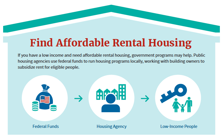
- We created an infographic to give a visual explanation of the key housing benefits programs, knowing that many people are visual learners.
We’ll re-evaluate our customer comments again in a few months to see if any of these changes helped make it easier for people to complete their tasks.


_v003.png)