When the content team wrapped up researching and drafting the Disability Services section, our UX team did two usability tests to determine how the new information should be organized in order to make it as easy to find as possible.
Card Sort
The team took the keywords people used when searching for disability resources and created an open card sort using OptimalSort software. Doing an open sort meant our test participants were able to sort randomly listed keywords into groups and create categories that made sense to them; a closed card sort would set predetermined categories. We tested 44 people, mostly federal employees.
Some quotes from our testers:
- "I couldn't make a sub-menu. I wanted to put "Insurance" under "Services" and then place both "Health Insurance" and "Disability Insurance" beneath "Insurance". Couldn't make a relevant match for "Youth Employment."
- "'Disability insurance' doesn't seem to go with any other topic, since it looks like it is intended for people who are not yet disabled or who do not recognize they may have a disability."
Result: We got a good start on how to organize the section and could then prepare a Treejack test.
Treejack Test
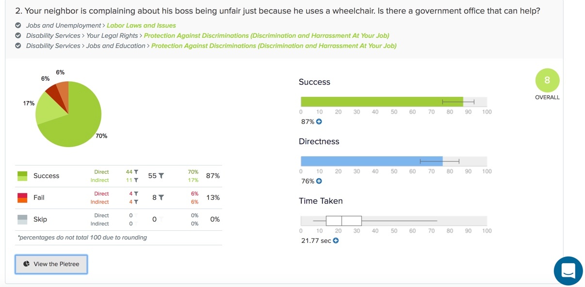
To help verify the categories our users created in the card sort and determine the findability of the content, we then did a Treejack test. Our test participants started the test on the main USAGov navigation page, which included the new Disability Services section. We tested 62 people, mostly federal employees again.
Some quotes from our testers:
- "It seemed like a few of these items could be found in multiple places in the hierarchy, and I wasn't always confident that the one I picked was exactly right."
- "For the first task, I would not think Alzheimers was a disability; I'd look under Health instead. Same goes for a couple additional items. Some of the menu groupings felt unintuitive."
- "I had no idea we offer any of these kinds of services and am not sure some of the naming made sense to me."
Result: We found out it was important for each piece of content to be under two or more different topics. For example, Employment Assistance for People with Disabilities should be under both the Disability Services section and the Jobs and Unemployment section.
Adding the New Section to the Site
Our designers had to find an icon and image for the navigation page. Once those were ready, they were added to our content management system.
The seven new pages were published first, but not added to the navigation. We added the code "META NAME="ROBOTS" CONTENT="NOINDEX, NOFOLLOW". This allowed the UX and content teams to QA the pages before they were crawled by Google and other search engines. Once we were done, we removed the code.
We'll continue to monitor and make tweaks to this section as needed.


.png)