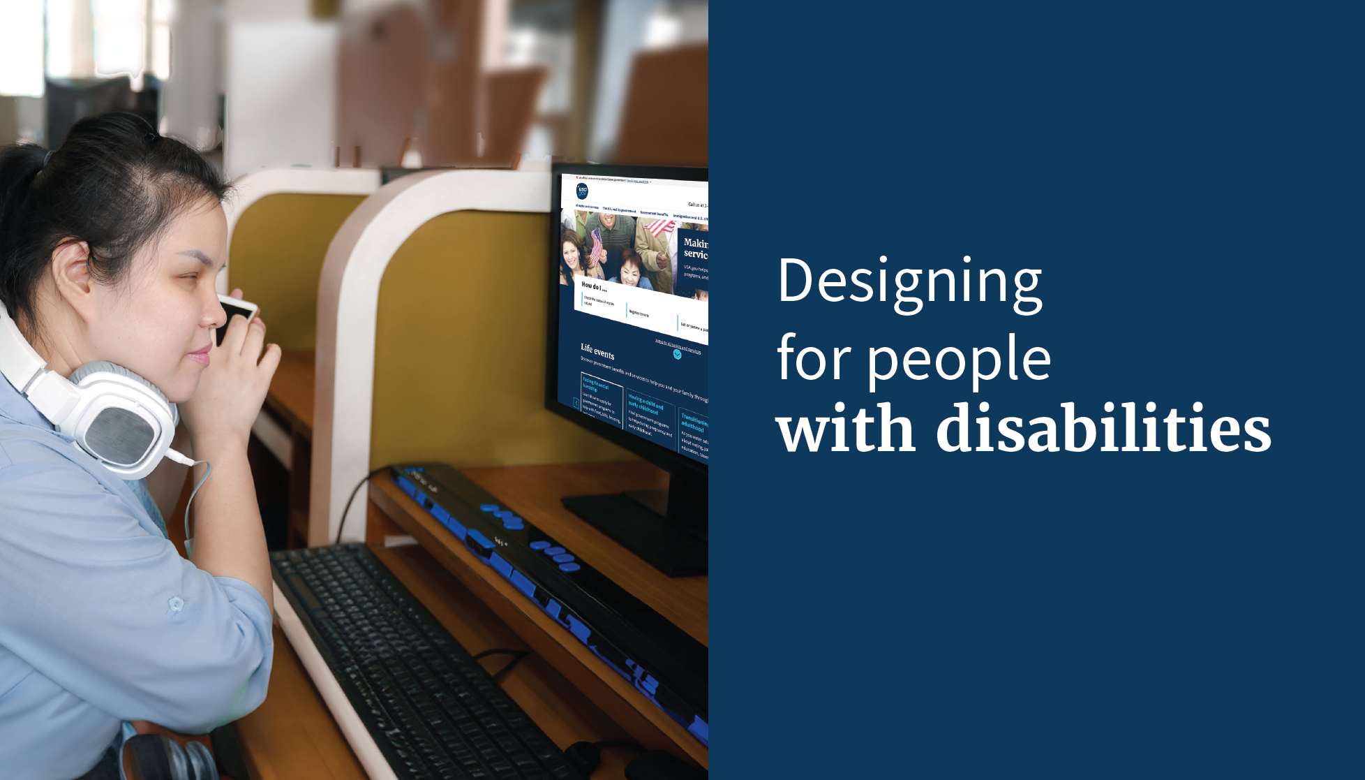
The Public Experience Portfolio's User Experience (UX) team consistently conducts research to evaluate various aspects of the program. We generally try to recruit a broad audience but also use a prequalification process to ensure diversity. Despite these efforts, we found we weren’t reaching the disability community as thoroughly as we would like. We decided to conduct a dedicated study with individuals who use assistive technology to access USA.gov.
Study overview
We teamed up with a local organization to reach out to people who use assistive technology. We were fortunate to meet with a diverse group which included 10 people who identified as legally blind users who require screen readers. Six mentioned they were blind since birth, and at least 4 also identified as being deaf. Seven of our participants were Braille hardware users.

Caption: The participation breakdown as presented in the assistive technology study report. Each shape represents a participant, including those who are legally blind, blind since birth, deaf, and use braille hardware, screen magnifiers, contrast, and screen readers.
We conducted generative conversation studies so we could speak with participants in an open-ended way rather than being tied to a strict set of questions. This helped us connect better with participants and yielded richer data. We structured our conversations to uncover patterns in participants’ information-seeking behavior and learn about their preferred channels of communication. Our goal was to learn about their pain points and highlights of communicating with the federal government, while also gaining a broader understanding of the accessibility experience on USA.gov.
Habits of assistive technology users
Through our conversations, we found that most of the participants were able to interact with the government online successfully. And we identified several habits of these assistive technology users.
- Everyone uses assistive technology differently. The people we spoke with tend to use only familiar websites or those recommended by people they trust.
- Most said mobile sites are easier for them to use because they are typically simpler, with less to manage.
- Assistive technology users have a natural inclination to skip website carousels as they have found these elements not always accessible based on their previous experience. They also don’t always wait for the screen reader to finish reading, which can lead to missed content, especially with long labels.
- Participants typically use the screen reader search capability which searches just the page. They didn’t frequently use the search box which searches the entire site.
Confirming some accessibility basics
Participants confirmed a few things we knew about accessibility.
- Clear heading levels are important for serving as critical markers for screen reader navigation.
- Sites that have moving or refreshing content or videos can pose challenges for accessibility.
- Using specific action-oriented descriptions rather than generic terms like “click here” or “see below” helps users know what to expect when they click a link.
What we learned about user interface design
- Sometimes an action a user takes while navigating a website is a wayfinding, especially when visual cues are absent. For example, when a user opens an accordion, the action of doing so functions like a bookmark, helping the user maintain their orientation on the page.
- The accessible name of something should match the on-screen text for it. The accessible name is the information that assistive technology uses to identify the element, and it can be derived from the element's content, attributes, or associated elements. Assistive technology such as screen readers and Braille displays will announce the accessible name aloud and also read the on-screen text. When they are not the same, it can be confusing and cause extra cognitive load for the individual.
Technical takeaways
- It is really helpful to use ARIA labels (Accessible Rich Internet Applications). These labels are part of the code on a web page. ARIA regions are like street signs to help people who use assistive technology understand what different parts of the website do and navigate the content more efficiently.
- Screen readers struggle with terms such as “drop down” or “toggle” for interactive elements because these terms do not sufficiently describe the functionality or state of the element. For example, if a menu is labeled as "drop down,” a screen reader may not understand that it can be expanded or collapsed, and may not communicate what kind of information is within the drop-down. Labeling an element as “toggle” does not inform the user of whether the toggle has been switched or not. Using wording within the code that does convey the state of the element, such as “aria_checked” for a toggle switch or “aria-pressed” for a button that has been pressed ensures the interactive elements communicate their purpose and state clearly, making for a vastly improved accessible interaction.
- Hierarchy of levels and subsets in the code helps the user navigate content and elements such as the heading and section structures.
Through these generative conversation studies, we have gained valuable insights into the disability community. Our findings highlight important habits and challenges related to technology and accessibility. These insights not only inform our current practices but also guide future improvements in product design and implementation. They include:
- Making our link labeling clearer
- Creating an easier way for assistive technology users to search for information about their state or territory
- Investigating ways to help keyboard users skip to main content faster
By continually refining our approach, we continue to enhance the accessibility and effectiveness of government services for everyone.


.png)