USA.gov’s Analytics Success: using analytics data to inform design and responsivity to create a better experience for the user
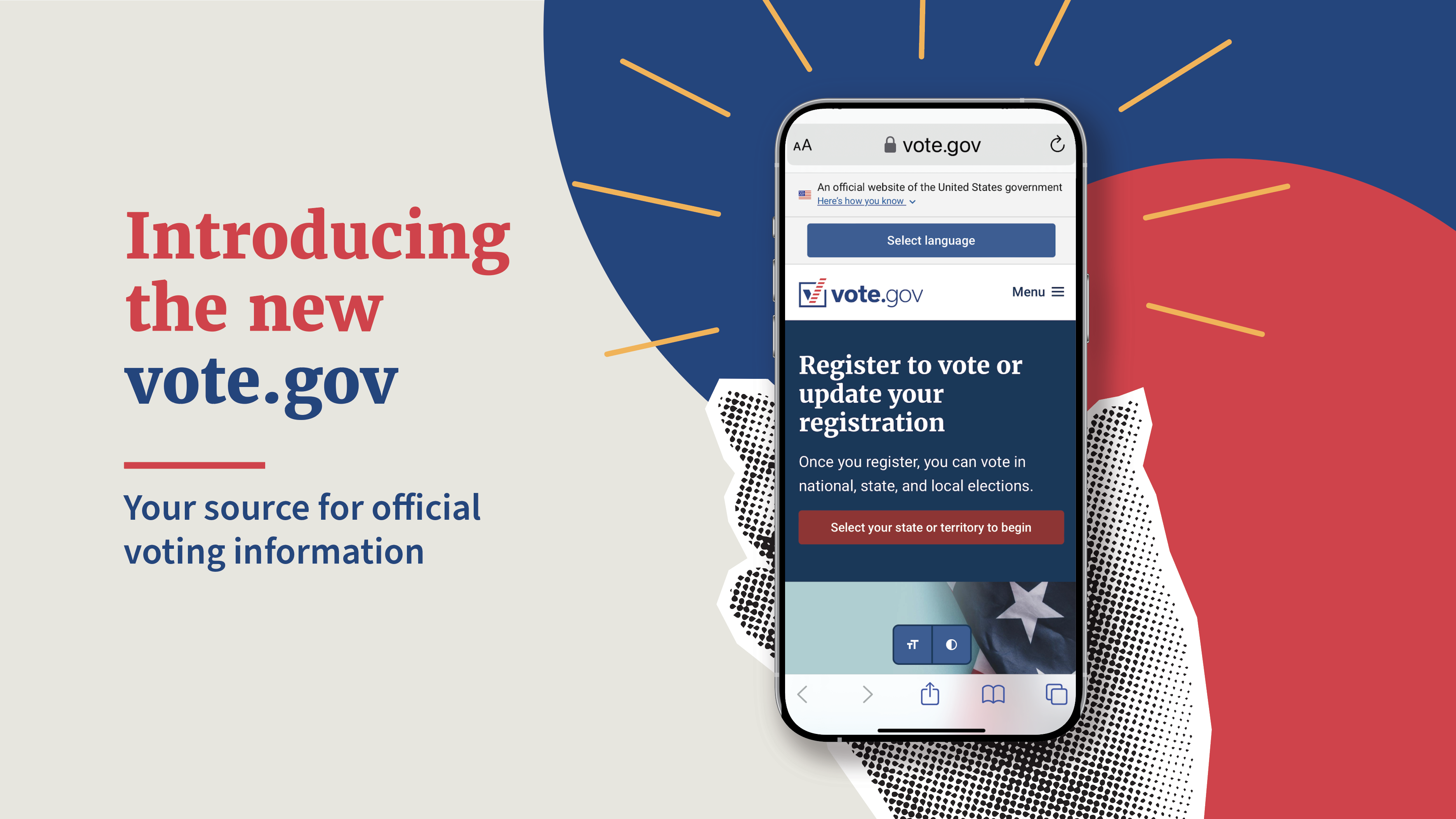
Last year, the USA.gov team found themselves facing a challenge. We were in need of a new content management system for our websites, USA.gov and Gobierno.USA.gov, which help people find and understand the most frequently requested government information. We wanted to align the content on those websites with content in the knowledge base used by our contact center; up until this point, the information in those two places had been similar but unique. In addition, we thought this was an opportunity for a design refresh.
That’s a whole lot of “new.” Where to begin?
We decided to start with the data! A lot of that data was from the Digital Analytics Program’s (DAP) Google Analytics (GA) account -- mainly, how were people using our current versions of the site?
Some of us set out to create a new knowledge base that would fill our future version of the site and our contact center’s customer resource management tool with wonderful content. We looked at usage of the existing content in our contact center and on the web in order to isolate the most needed content. For web content, we used GA, in particular, unique pageviews for an entire year. Some of our content is seasonal, so it helps to look at a year at once. Using unique pageviews helped us line up a little bit better with our data sources like content used by our contact center agents.
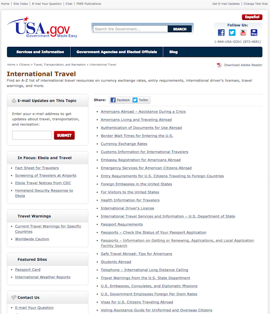
The GA data helped us know what was most popular in obvious ways, and therefore what to keep and what not to keep. However, it also influenced our understanding of our users’ needs in a way that influenced our design. USA.govand GobiernoUSA.gov have a handful of standout popular content, but even the standout content really just adds up to a small portion of the overall site usage. That helped us understand that we wouldn’t be focusing prominently on any dominant tasks.
To better understand user behavior, we wanted to know how people got to our sites, where people started their visits, what they did when they got there, and how long they stayed. Google Analytics was helpful on all counts. Most users came from search engines, and they primarily did not land on our home page. Rather, they started their experience with us on a content page somewhere within our site, and for them, that was in effect our home page. This influenced our design by telling us that users would be orienting themselves on pages that we normally wouldn’t consider as a place to come to understand what our website is about. This was one of our data sources that convinced us to really pare down the design to just the essentials: one primary place for content, navigation, and search.
GA told us that our visitors did not hang out with us for very long. After jumping into the middle of our site from a search engine, they most often read the content on that one page and then used one of our links to pursue what they were trying to do. This was despite having a design that had columns of little boxes about other things that people might be interested in; so GA was one of the data sources that convinced us to strip that out. For those visitors that did stay with us for more than one page, there was a big drop off after two or three pages. That led us towards a controversial decision: the parent pages that would feature links to the section “beneath” them would not share the navigation choices on the left side that the content pages would have. We simply lacked the data to point to that supported people wanting to navigate up and up, step-by-step. Now that we have time, we are actually implementing a new navigation on parent pages, and we’ll be interested to see the impact.
Google Analytics also helped us understand that mobile users were becoming an increasing percentage of our customers. This contributed to our desire to make sure that our design was equally direct for users on mobile and desktop, and therefore to allow our writers not to think about different platforms when writing. The result was one column of content on every type of device. If an idea wasn’t important enough to be included in the main content, then it didn’t need to be in a desktop-only bonus box on the side.
Overall, Google Analytics usage data helped us pare down a sprawling site with busy content pages in a more efficient site that catered to its true primary users: people jumping in from Google to get an overview of a topic and know where to go next, and perhaps check out very closely related information as well. It’s also been hugely influential on our home page designs, as we strive to create a home page that enables the types of uses for our site that are most prevalent. But that’s a blog post for another day!
David Kaufmann is a member of the Analytics and User Experience teams at USAGov.